TouchFree
TouchFree
TouchFree
Product Design for TouchFree Displays
Product Design for TouchFree Displays
Product Design for TouchFree Displays
Building a product enabling users to interact with displays without touching anything.
Integrated into a cross-disciplinary product team, I set out to achieve product success through user centric interaction design, redesigning application UX, running large scale user and product validation studies, creating design guidelines for external development teams and designing showcases to gain market traction.
Example: Transactional use case
Ultraleap cameras track the users hands in 3D space. These cameras are attached to public screens to enable users to interact without touching anything. The user moves their hand in front of the screen to target different elements and can select and scroll content in a number of ways.
Enabling users to use screens without touching them, TouchFree is a revolutionary product with many benefits. However, ingrained user expectation of interaction with OOH (out of home) touchscreens leads to a significant design challenge. Tasked with improving interactions and UX of OOH interfaces. This project required considerable user understanding, product direction, interaction design and large scale user studies.
Example: Experiential use case
Research Achievements
Research Achievements
Research Achievements
Understand the issues with the original TouchFree application
Understand user expectation of TouchFree interaction on touchscreens
Understand opportunities within transactional and experiential use cases
Understand reliability and intuitiveness of interactions and user interface in a transactional use case
Facilitate usability testing programme
Deliver a large scale quantitative and qualitative user study of customer deployment
Design Achievements
Design Achievements
Design Achievements
Redesign and improve UX of TouchFree Application
Improve the interaction set to match end user expectations
Minimise end user learning curve with onboarding
Work closely with customers to deliver design for deployments
Created design guidelines for engineering teams
Used the OOH vertical as an example of a product and user led project with the aim of changing the culture of Ultraleap
Milestone
Designing TouchFree 2.0
Designing TouchFree 2.0


Discovering issues with the existing TouchFree application
Discovering issues with the existing TouchFree application
First off I needed to understand what issues there were with the existing application, designed for engineering teams and on-site kiosk integrators. From customer conversations, I found that TouchFree being split into 2 separate apps, "TouchFree Application" and "TouchFree Service" was causing friction. Software integrators were unsure which features were in each application, often opening the wrong application leading to a lucky dip of which app to open. It was also uncovered that there was a large friction point with camera calibration. Often people setting up TouchFree are on-site setting it up on a kiosk where there is no table to place a keyboard, however calibration required use of a keyboard. These users hated that they had to have one hand free to point at the calibration marker and use their other hand to both hold a keyboard and press a button at the same time.
First off I needed to understand what issues there were with the existing application, designed for engineering teams and on-site kiosk integrators. From customer conversations, I found that TouchFree being split into 2 separate apps, "TouchFree Application" and "TouchFree Service" was causing friction. Software integrators were unsure which features were in each application, often opening the wrong application leading to a lucky dip of which app to open. It was also uncovered that there was a large friction point with camera calibration. Often people setting up TouchFree are on-site setting it up on a kiosk where there is no table to place a keyboard, however calibration required use of a keyboard. These users hated that they had to have one hand free to point at the calibration marker and use their other hand to both hold a keyboard and press a button at the same time.


Consolidating into one application with a tabular navigation structure
Consolidating into one application with a tabular navigation structure
With the critical issue discovered of confusing feature structure across separate applications. I strongly advocated for a singular TouchFree app with our product owner where no issue or better solution was previously perceived. Presenting the issue, the problems it caused for our users and demonstrating the potential solution received the buy-in to make this substantial change.
With the critical issue discovered of confusing feature structure across separate applications. I strongly advocated for a singular TouchFree app with our product owner where no issue or better solution was previously perceived. Presenting the issue, the problems it caused for our users and demonstrating the potential solution received the buy-in to make this substantial change.
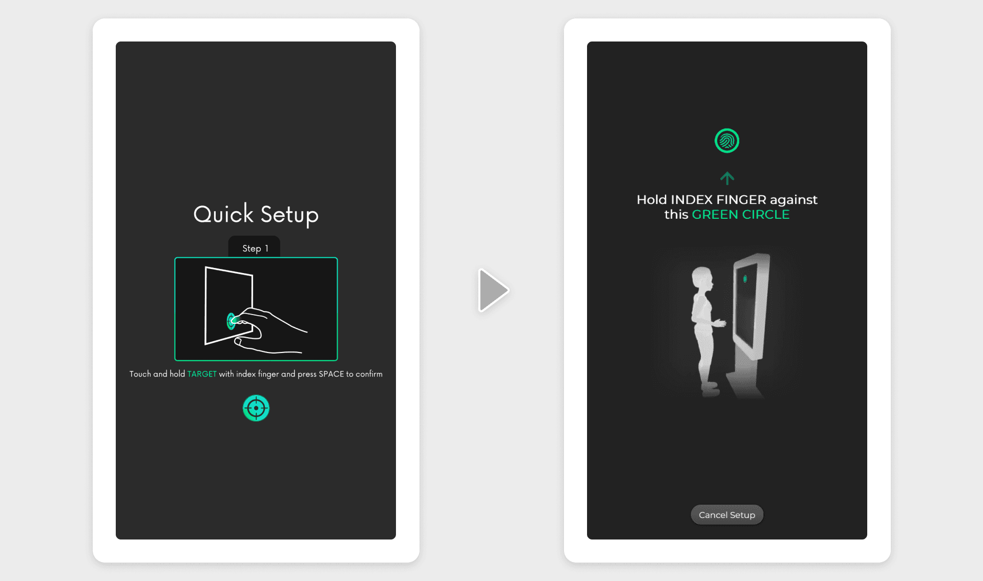

Reducing friction during the setup process
Reducing friction during the setup process
Another large friction point discovered during the research was the requirement to press a keyboard button when calibrating, meaning the user must hold a physical keyboard and press one of the keys with a single hand as our users were often stood up, with no desk or table available. We had to remove this friction. Ongoing interaction research showed that aiming and holding the hand still for a small number of seconds was a successful method of selecting. I therefore designed a solution where the user touches their index finger against the screen and holds it there for 4 seconds, reaching the timeout without moving captures the calibration point. Out users loved it, removing the friction and awkwardness of holding a peripheral keyboard and keeping the flow of touchscreen interaction consistent.
Another large friction point discovered during the research was the requirement to press a keyboard button when calibrating, meaning the user must hold a physical keyboard and press one of the keys with a single hand as our users were often stood up, with no desk or table available. We had to remove this friction. Ongoing interaction research showed that aiming and holding the hand still for a small number of seconds was a successful method of selecting. I therefore designed a solution where the user touches their index finger against the screen and holds it there for 4 seconds, reaching the timeout without moving captures the calibration point. Out users loved it, removing the friction and awkwardness of holding a peripheral keyboard and keeping the flow of touchscreen interaction consistent.


Quality UX through the customer journey
Quality UX through the customer journey
To accompany TouchFree 2.0 the customer journey needed to be seamless from start to finish. TouchFree is a brand new concept for most so a quality customer journey was critical to building trust in this new technology. From creating quality demos, in depth documentation with a strong consideration for information architecture, user centric UX design of TouchFree 2.0 and BD, Engineering and UX support throughout, the customer journey built trust with TouchFree customers.
Data collection opportunities were important throughout, creating learning opportunities at a B2B level during customer touch-points and learning opportunities at a B2B2C level to observe how our customers end users experience the technology on-site.
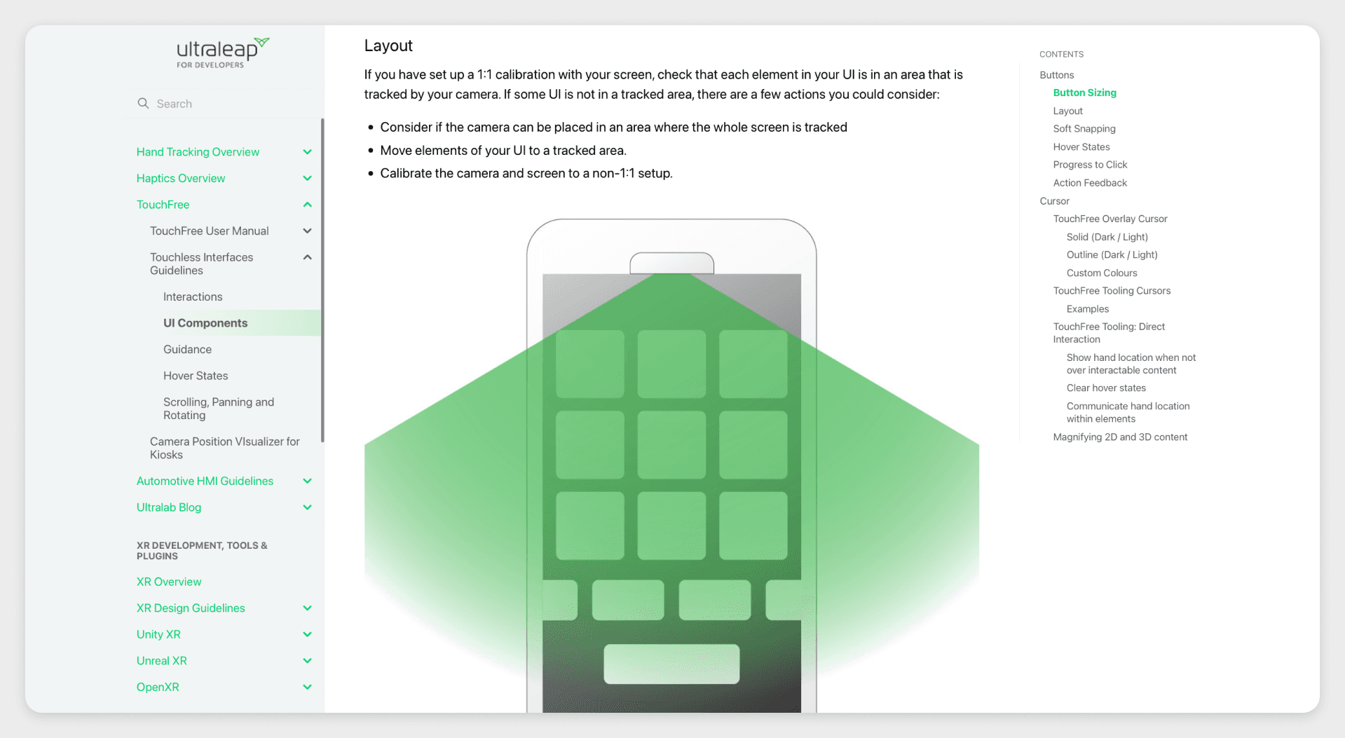

Creating and structuring customer documentation
Creating and structuring customer documentation
TouchFree is a new technology for most, with setup constraints and its own best practices for UX and interaction design. I wrote and created clear and insightful design guidelines for external engineering and design teams to create interfaces which use best practices for TouchFree interaction, ensuring quality experiences with minimal input from Ultraleap.


Reducing learning curve by creating more intuitive and robust interactions
Reducing learning curve by creating more intuitive and robust interactions
Interactions were previously created with minimal exposure to end users. On entry into the OOH vertical, I brought in a foundational interaction research program, including continuous interaction design improvements and regular usability testing with varied users.
Through user studies I found that users naturally perform a short tapping interaction to select rather than a long forward push as required by the existing interaction. Over the course of the foundational interaction program the AirPush interaction continually became shorter and more accepting of angle as variations were continually tested with users until it eventually allowed for a short tapping interaction, enabling users to interact how they expected, dramatically reducing learning curve. Scrolling also became much more of a swiping interaction than a rigid push forward and move to meet user expectation.


Quantitative data collection
Quantitative data collection
Along with qualitatively understanding interactions using representative websites and applications we created a selection app for quantitative data collection. Focused on the interaction quality of selecting buttons, the application collected a small amount of demographic information and then tracked the users accuracy, mis-clicks and speed so we could compare new interactions to the existing ones.
Along with qualitatively understanding interactions using representative websites and applications we created a selection app for quantitative data collection. Focused on the interaction quality of selecting buttons, the application collected a small amount of demographic information and then tracked the users accuracy, mis-clicks and speed so we could compare new interactions to the existing ones.
Milestone


Creating demos to showcase new and improved interactions
Creating demos to showcase new and improved interactions
Led by existing customers and industry trends at the time, using our use case map, I worked with our VP and product owner to devise a demo set which would demonstrate our solution well while building upon our most promising use cases.
I designed demo applications for quick serve restaurants, wayfinding and product exploration demonstrating the unique benefits of our TouchFree solution. Including hover states, hygienic interaction and engaging experiences.


Collecting insights from trade shows and usability testing to improve interactions and demos
Collecting insights from trade shows and usability testing to improve interactions and demos
With a lack of pilots at the time, we needed a way of collecting data from a large exposure of people to our solution. I therefore became a yearly attendee at Ultraleap's booth at NRF in New York City to talk to people who had used our solution for the first time, observe and report back with the aim of testing the current solution for both interactions and user interfaces with the aim of improving interactions and creating design guidelines so people can design their own applications using proven design guidelines.
With a lack of pilots at the time, we needed a way of collecting data from a large exposure of people to our solution. I therefore became a yearly attendee at Ultraleap's booth at NRF in New York City to talk to people who had used our solution for the first time, observe and report back with the aim of testing the current solution for both interactions and user interfaces with the aim of improving interactions and creating design guidelines so people can design their own applications using proven design guidelines.
Milestone
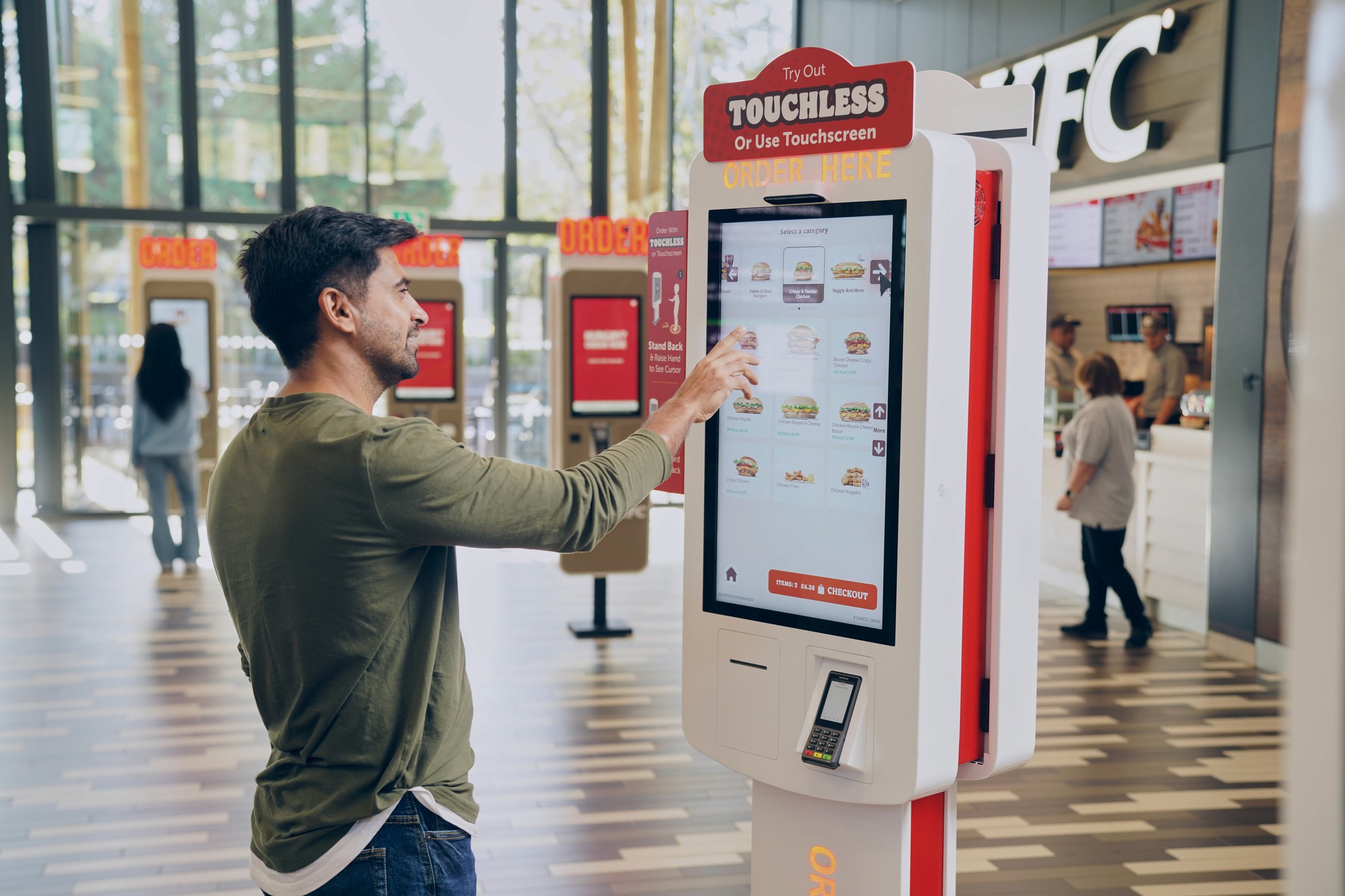

Deploying TouchFree to a quick service restaurant for a large scale user study
Deploying TouchFree to a quick service restaurant for a large scale user study
Our customer wanted to use our solution to increase customer satisfaction by providing a hygienic but exciting interaction solution from their touchscreen kiosks.
I had 6 weeks to work with an engineering team in India to design and build the TouchFree interface, integrate and plan a research study to gain the most value from the 10 week pilot. I spent around 12 days on-site conducting disguised quantitative and qualitative observations of end customer periodically over the study. Results from each visit fed into iterative design improvements, leading to a rate of customers choosing to use TouchFree which met the clients success criteria. Quantitive data had the aim of understanding interaction robustness, user types and onboarding attention. On-site interviews study had the aim of understanding how our solution could be improved as well as motivation for use and desirability. Both the quantitative and qualitative studies were used to understand how the product could be improved and used to gauge the success of the pilot both internally and externally with the client.
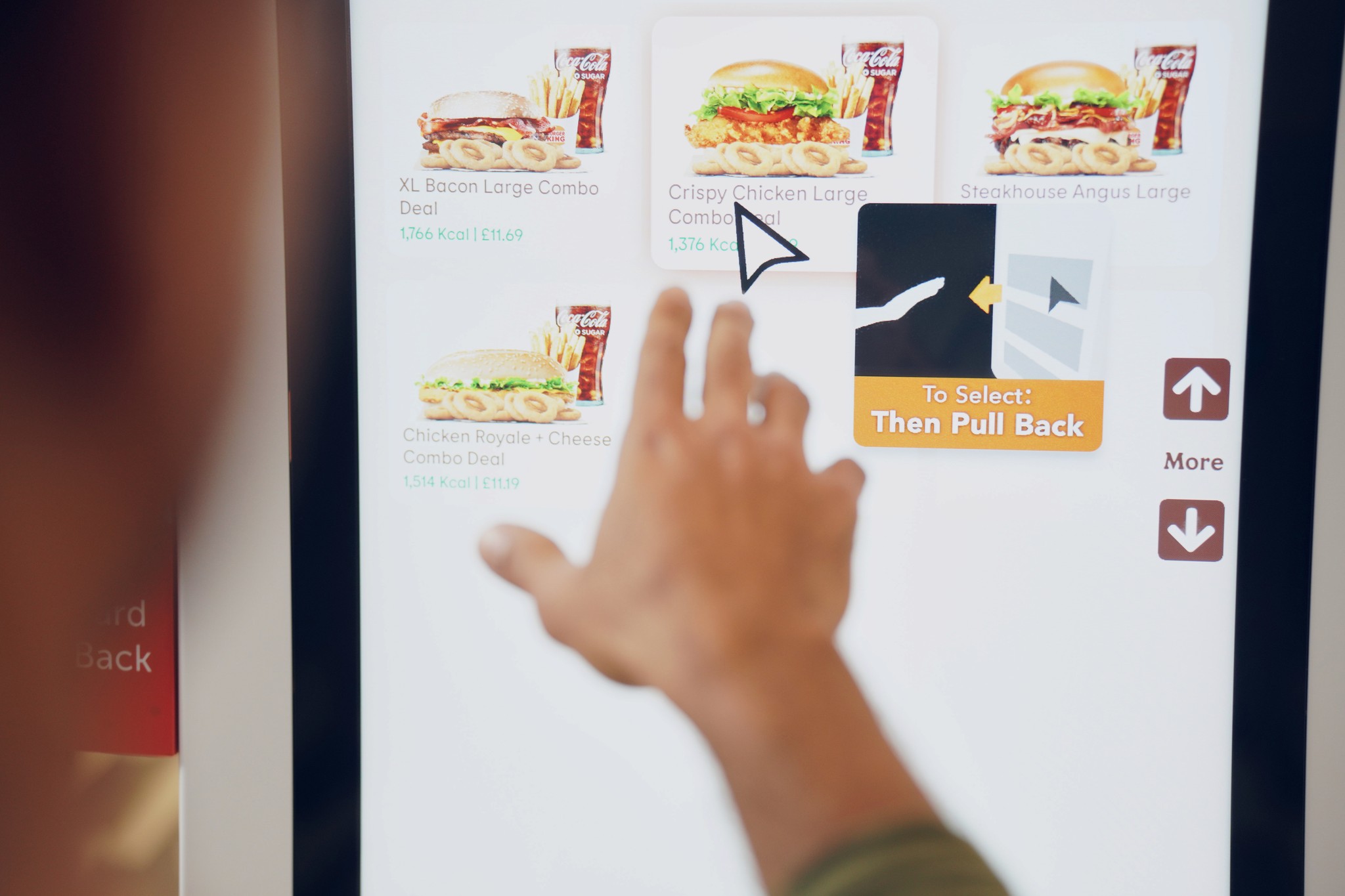

Clear but noticeable onboarding reduced learning curve
Clear but noticeable onboarding reduced learning curve
Printed guidance and onboarding animations in fixed locations of the screen were successful in our foundational interaction research, with users noticing the guidance and following it in a lab environment or low stress museum settings. However, on-site in a high traffic, high stress environment, none of this was generally noticed by the public, with <5% of customers using TouchFree and the rest ordering using touchscreen. This was a huge problem because people were generally unaware that they could interact touchlessly meaning our pilot would eventually fail.
To tackle this, I created a small, simple onboarding video which could be attached to the TouchFree cursor which the user would notice when first bringing their hand to the kiosk. Observing users on-site, TouchFree interactions tended to be fully learnt after the 3rd selection, and not be annoying, the video would disappear after the interaction had been fully learnt after the first 3 TouchFree selections.
This cursor guidance completely changed the game and TouchFree orders immediately went up to 20% of customers choosing to use TouchFree rather than touchscreen
Experiential advertising
Product personalisation
Diversifying the product with experiential use cases
Diversifying the product with experiential use cases
The quick serve restaurant pilot proved a clear value proposition for some user types by providing a hygienic, future facing solution. I explored a number of use cases outside of transactional as the data from the study had proved that it was an engaging experience and people genuinely enjoyed ordering using TouchFree at quick serve restaurants.
My research showed that experiential retail was an emerging product opportunity for us. I found that memorability and increasing brand equity were key drivers for experiential retail experiences which fit with motivations and end user satisfaction after using TouchFree in the pilot. Working with the VP and product owner we began branching out into experiential retail use cases, focused on providing engaging experiences and creating fun and enjoyment for customers in retail environments.
Bringing hover states to touchscreens with Augmented Touch
Bringing hover states to touchscreens with Augmented Touch
People also loved hover states. Touchscreen UI's can feel static and lifeless because on their own, there is no way to react to the users hand before they touch the surface. Working with our product owner, I sought to design an application which demonstrated the value of touchscreen hover states for various uses, both engagement and utility. By providing extra information when hovered over an element but also providing surprise and delight with animation, making elements feel full of life and engaging.
People also loved hover states. Touchscreen UI's can feel static and lifeless because on their own, there is no way to react to the users hand before they touch the surface. Working with our product owner, I sought to design an application which demonstrated the value of touchscreen hover states for various uses, both engagement and utility. By providing extra information when hovered over an element but also providing surprise and delight with animation, making elements feel full of life and engaging.

