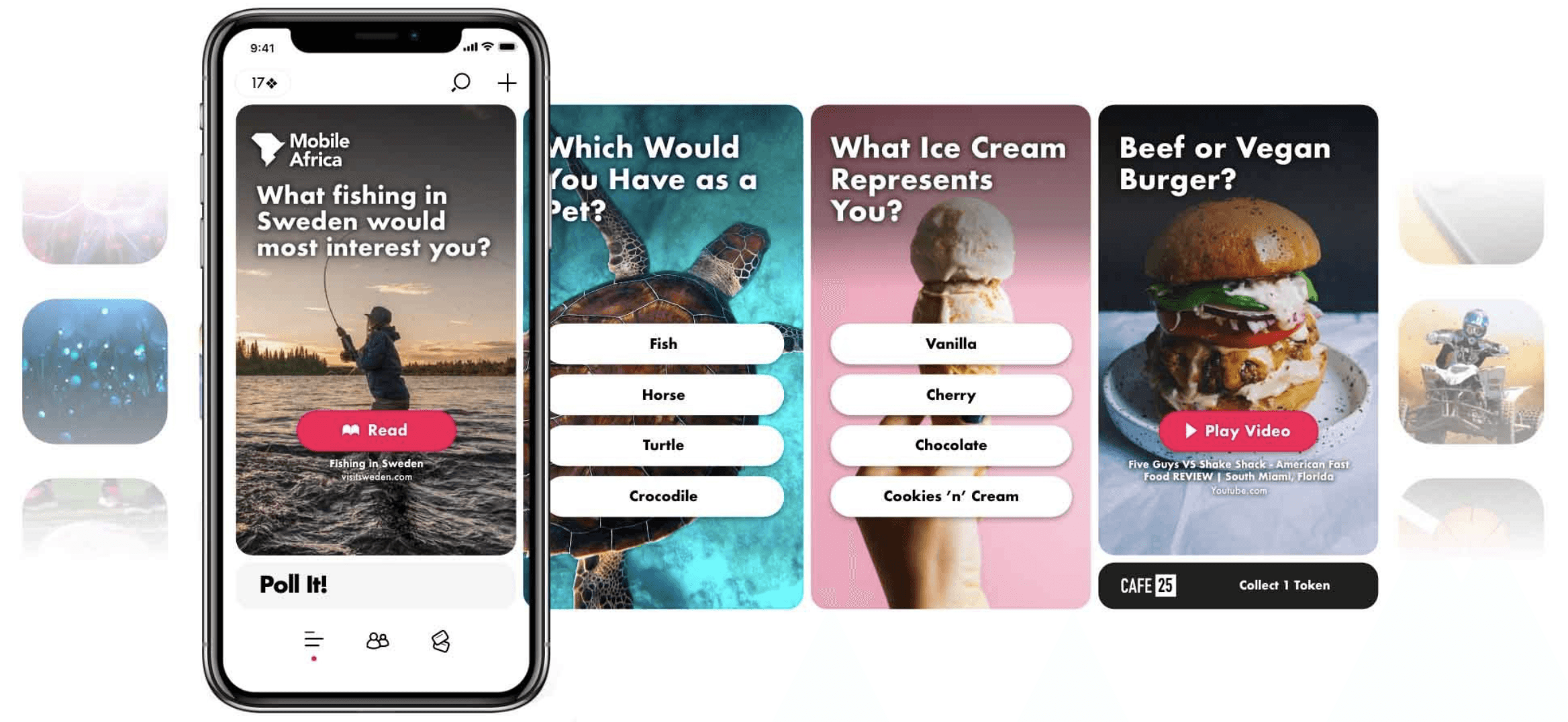
Creating a socially conscious platform connecting people with others, brands and charities
Interview target user base to understand motivations and user preferences
Facilitate usability testing rounds
Interaction design
Low fidelity wireframes
High fidelity prototype
Design guidelines
Design Process
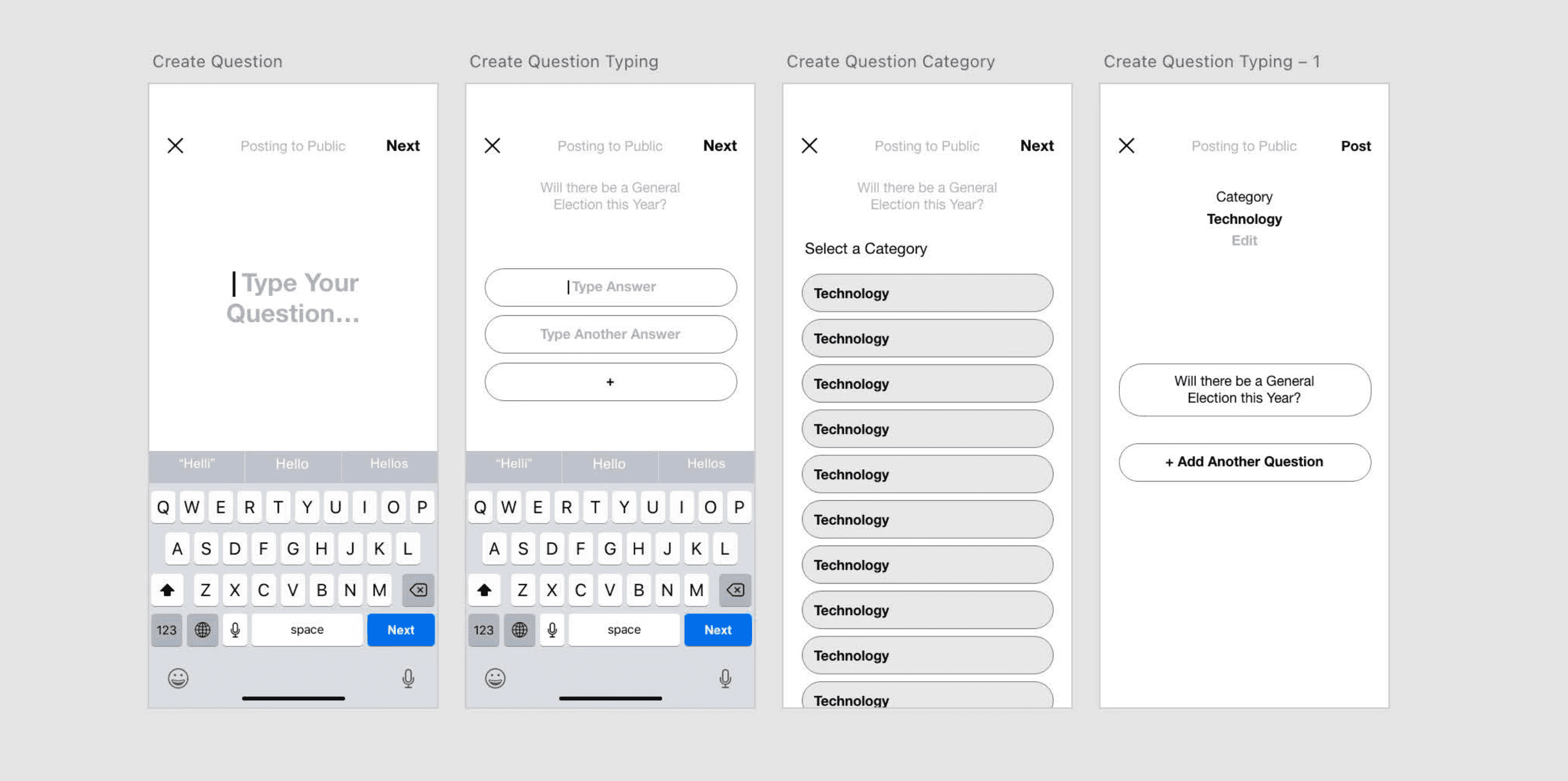
Focusing first on the primary interaction mechanism, I created varied interaction concepts. A small number of chosen concepts were quickly tested with end users using paper prototypes.
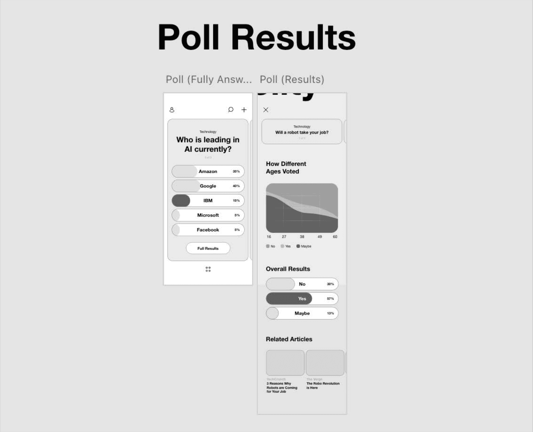
Working up the most successful interaction concept into a mid-fidelity wireframe
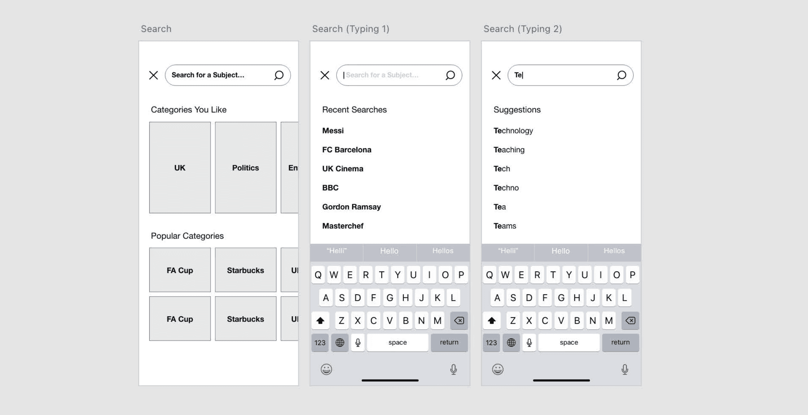
Looking at how users can discover content of interest beyond the newsfeed
Looking at how users can discover content of interest beyond the newsfeed
After mid-fidelity prototyping and several rounds of usability testing and iteration, I created a high fidelity prototype and worked with our engineers to execute into a commercialised product
Design System
This design guide has been created for use by designers working on the Poll It Social Networking mobile application. Desktop products should follow the same standards however may be altered to meet desktop requirements where needed. We’d recommend fine tuning design to meet design standards for Android and iOS.
Colour
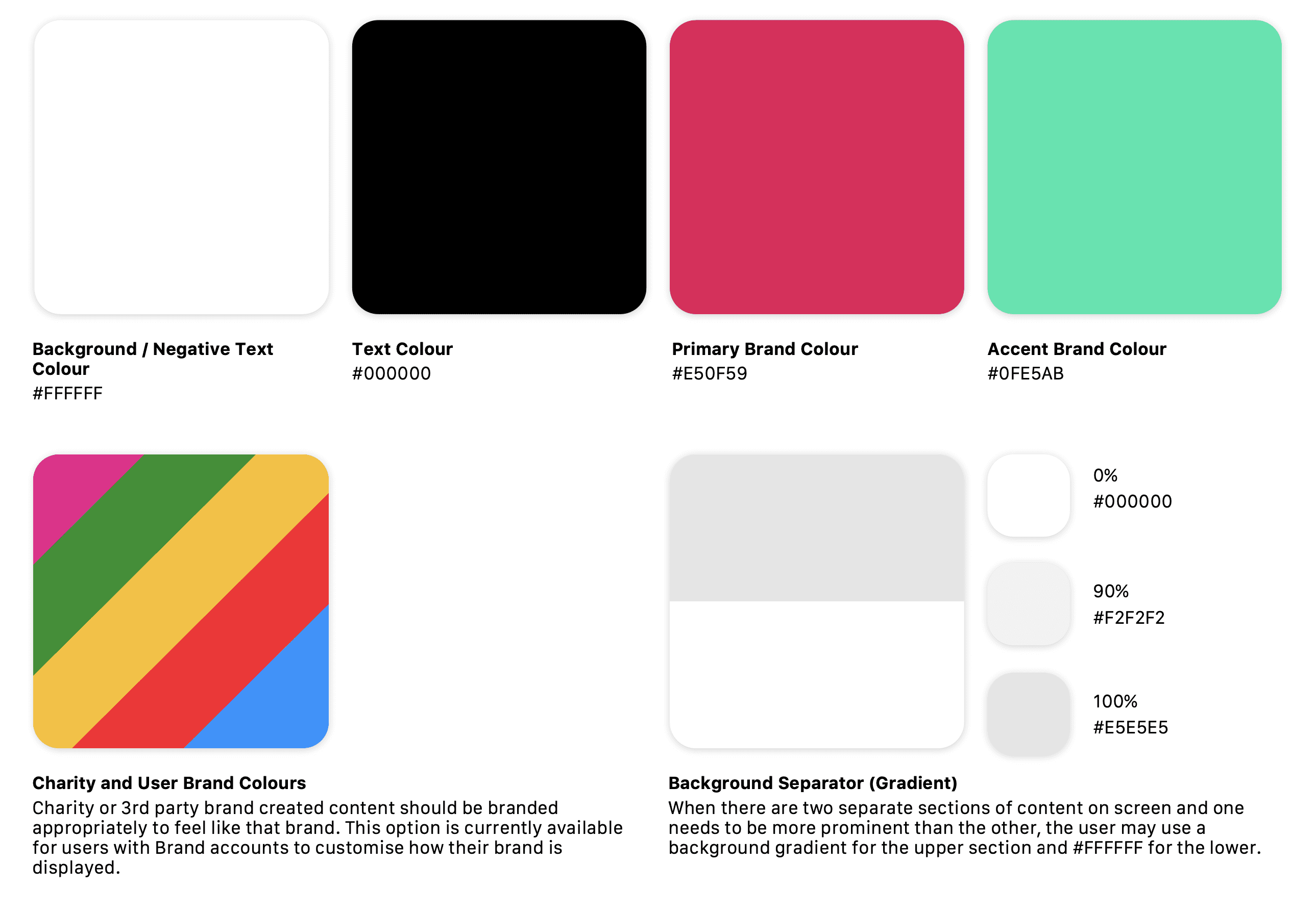
Colour usage is overly white throughout to allow the focus to be put on useruploaded content. Where attention is required, the designer may use #E50F59 as abackground colour with #FFFFFF text or icons on top. #0FE5AB may be used whenan accent colour is required or for confirmation signifiers
Shapes
To create a fun and lighthearted feel, heavily rounded corners are used throughout.For brand consistency and recognition, we’d also recommend following the samestyle for any marketing material produced. This roundedness follows through to font choice and icon style as displayed bellow.
Text
Text has a focus on legibility, avoiding font sizes smaller than 16pt where possible. The target market is broad (although initially focused on students) therefore there is a likelihood of people with visual impairments using the application.
Icons
Icons follow a uniform outlined, rounded style throughout. We would recommend any new icons following this house style. The two exceptions are Charity Score and Tokens as these are icons designed to feel different and draw the user’s attention
Layout
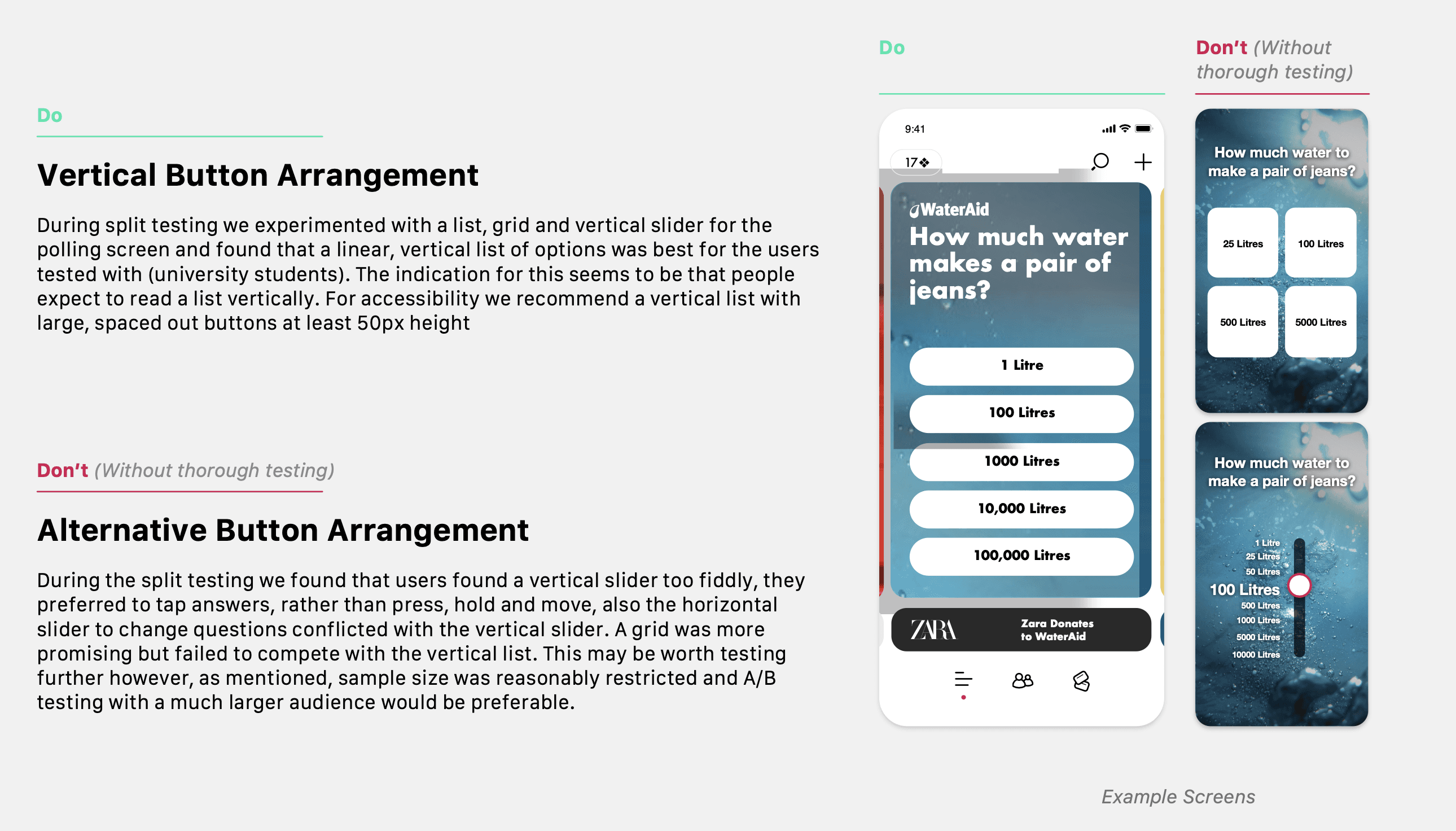
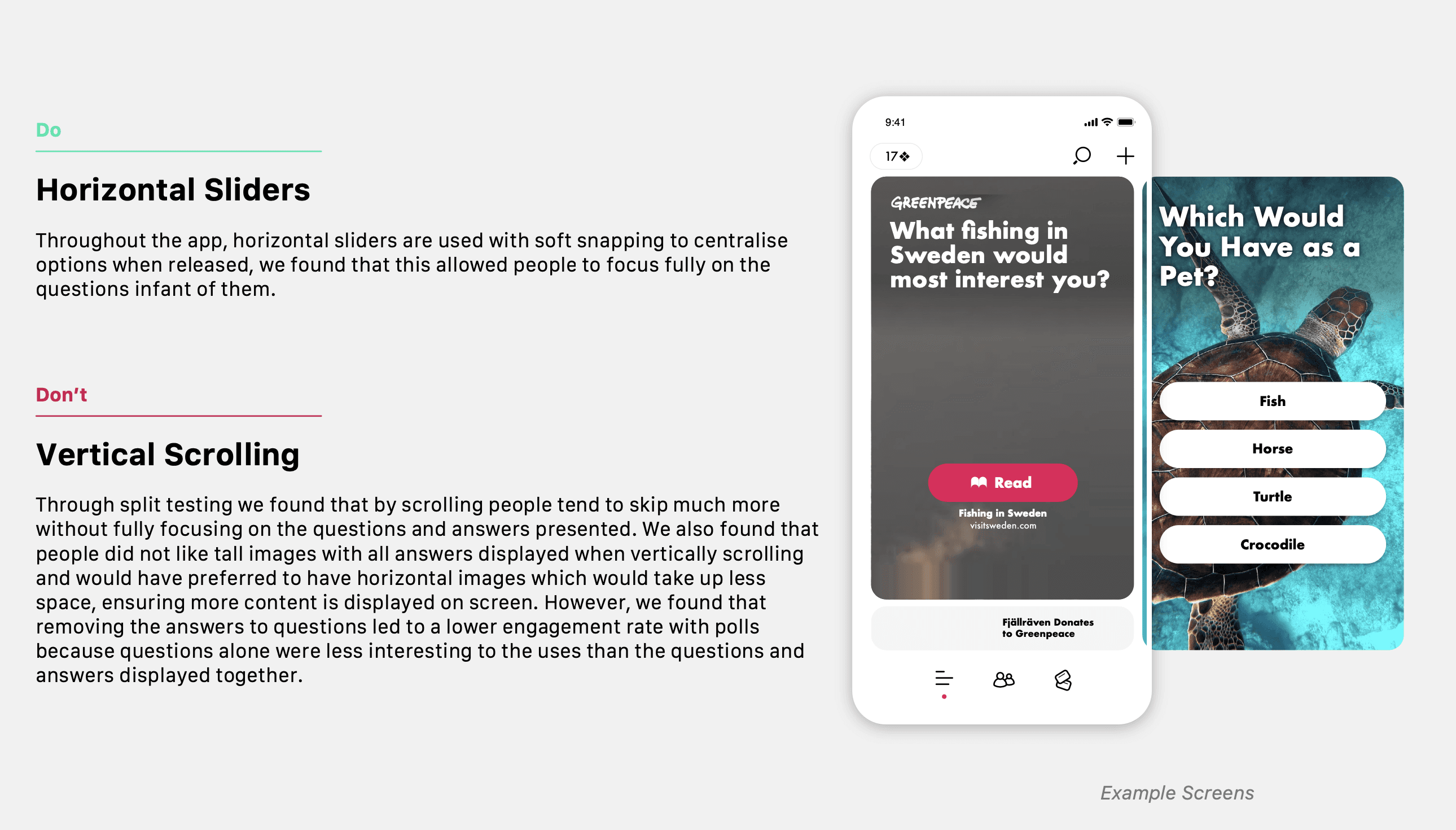
During the project, thorough usability testing was conducted during each sprint with the initial target users (university students). Along with usability testing, some of the initial sprints involved split testing, this gave an indication of direction for layout, however as mentioned we’d recommend more thorough A/B testing in the future.


