Overview
The client provides medical staff with training for top tier sporting events. The level that they’re practicing at demands the most rigorous and professional training experience. They wanted a VR training platform to see expand their training to become more memorable and effective.

Uncover the clients needs to formulate product idea and features
XR experience storyboarding
Creating user flow and UX/UI design
3D prototyping and modelling of all apparatus
Unity animation

Working with reference images, I modelled many parts of apparatus for the lead and support medic to handle over the duration of the training experience .
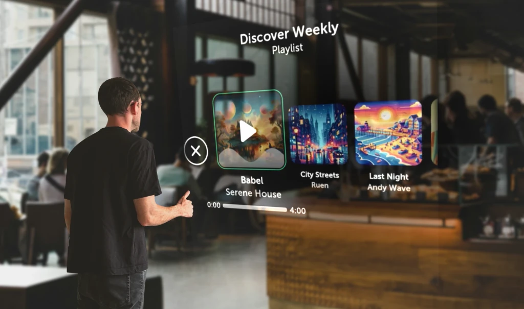
Where possible, direct interactions are used to increase memorable due to the physicality of the interactions. Being as close as possible to a real life training situation this enhances intuitiveness of the training experience.
Users can be in any location around the incident, therefore they required a quick access menu which could be accessed from where they were stood for actions used throughout the scenario. The medics often wear smartwatches while on duty, leaning on that familiarity, users are able to tap the smartwatch to access quick menu options. As the user taps one of the options, the button moves downwards, confirming the tap.
Occasionally during the experience, the lead medics hands are both occupied, when supporting the patients head for example. In these situations I used the physical buttons on the controllers to select different options
Wireframes

Menu Interaction
At the beginning of the scenario, users will need to input their name along with a few other menuinteractions to join/create lobby and start the scenario.
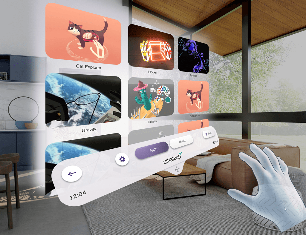
Using the software provided, users were able to grab groups of objects to recreate the interaction.
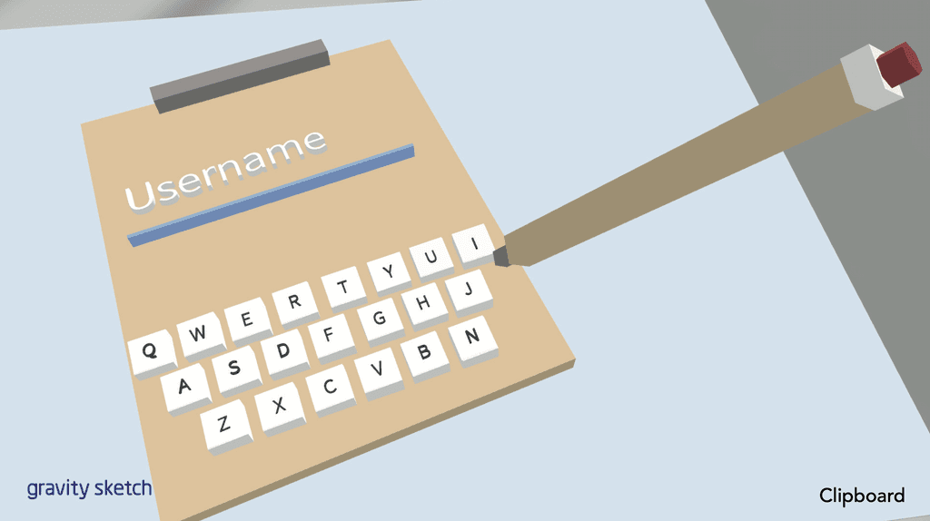
They found the watch to be too fiddly for fine input such as tapping characters on a keyboard. This was because the keyboard (attached to the users lefthand) would be moving in 3D space, as well as the users right hand.
Keyboards fixed to a world position proved much more successful as users were able to input easier with a static target. The participants immediate reaction is to use two hands to type which lent to the more traditional keyboard designs.
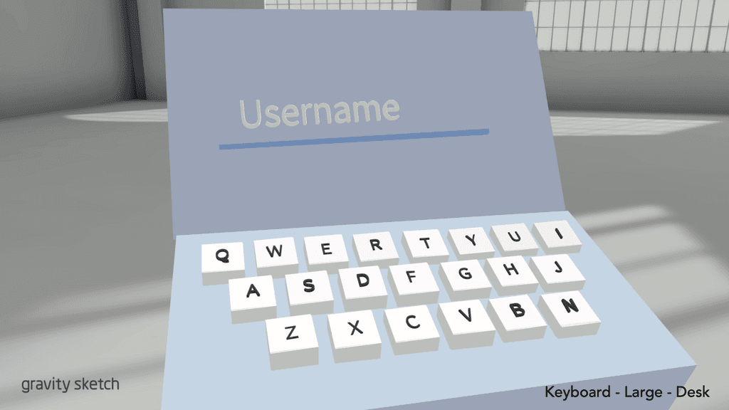
We found that the smaller keyboard proved to be a bit fiddly and with it floating in the world, people were unsure how far to press each key to activate the character.
Keyboard - Large - Desk provides users with largekeys for easy input and would be able to activatecharacters once it becomes level with the desk, providing users with a clear signifier.


Actions Interaction
During the scenario, users will be required to perform a number of dilogue inputs and contextual actions such as “call ambulance”.
For the purposes of this test, a manequin, representing the patient was placed in the scene in an appropriate location to the user and interaction element.
The participants found the whiteboard a novel idea, however thought that it was too distracting and large. People had concerns that it would get in the way, especially when a second or third user is added to the experience.
The clipboard was more successful, however people felt that it would still get in the way with multiple people crowded around the patient. Therefore we’d need some way of spawning it into the environment when needed.
The watch was much more successful, people experimented by attaching the watch and pop up to the left controller and role playing tending to the patient. The participants felt this enabled them to use the action interaction at any time, even when they’re kneeling down over the patient. The option buttons were also a good size to be accurately pressed.


Inventory Interaction
During the scenario, the user will need to spawn in different apparatus to the scene for treatment of the user.
Overall participants preferred the options where the objects were their real size as they could just pick them up and start using them. In the watch design example, the object would need to be tapped or pulled out small and appear larger in the users hand or elsewhere in the world.
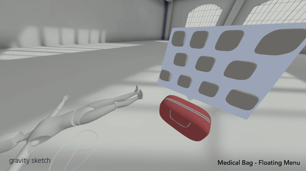
Examples with true to size objects were successful with people split between a menu opening over the medical bag and the items being spread out on the floor.
They liked how the menu over medical bag took up little space and felt having them stacked vertically would be easier to reach ergonomically as the user doesn’t have to keep bending down.
The options where the items are layed out on the floor were appealing to the users as it felt more realistic not having a floating menu.